10 Ways Responsive Design Enhances User Engagement
Learn how responsive design improves user engagement, enhances usability, and ensures a consistent experience across devices.
In today’s digital landscape, Responsive Design is no longer a luxury—it’s a necessity. With users accessing websites from a variety of devices, ensuring a seamless experience across different screen sizes is critical for engagement and satisfaction. A responsive website not only adapts to varying devices but also creates a consistent and intuitive experience that keeps users engaged.
This article examines how responsive design impacts user engagement, highlighting its benefits and strategies for implementation.
What is Responsive Design?
Responsive Design is an approach to web design that ensures websites adapt seamlessly to different screen sizes and orientations. Whether a user accesses your site on a smartphone, tablet, laptop, or desktop, responsive design guarantees optimal usability.
By using flexible grids, media queries, and scalable visuals, responsive design creates a consistent user experience across devices. This approach aligns with Google’s mobile-first indexing, which prioritizes mobile-friendly sites in search rankings.
"Responsive design is not just about screens; it’s about people." – Jeffrey Zeldman
How Responsive Design Enhances User Engagement
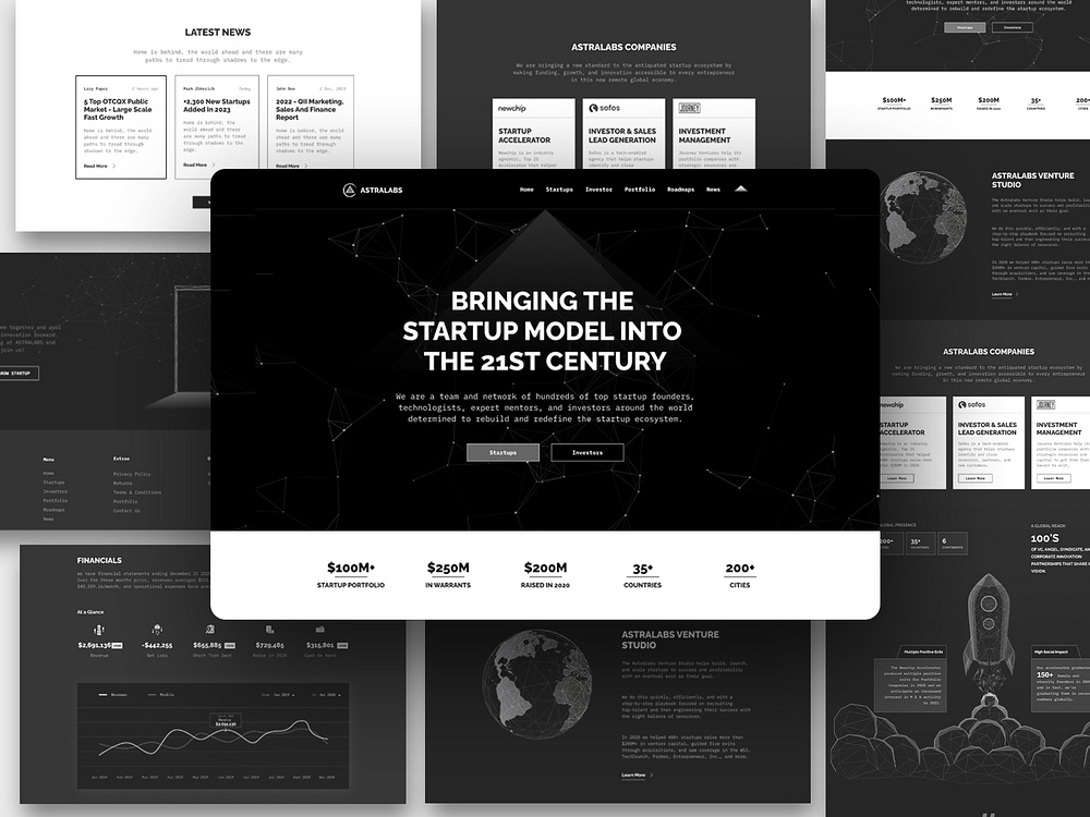
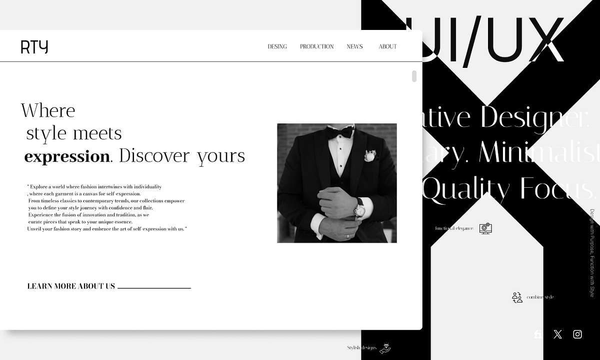
Improves Usability Across Devices A responsive website ensures users can navigate your site effortlessly, regardless of the device they’re using. Clear menus, readable text, and touch-friendly elements make the experience intuitive and frustration-free.
Reduces Bounce Rates Users are more likely to stay on a site that loads correctly on their device. Responsive design eliminates the need for pinching, zooming, or scrolling horizontally, resulting in lower bounce rates and longer session durations.
Enhances Accessibility Responsive websites cater to diverse user needs, ensuring content is easily accessible to everyone. From text scaling to touch navigation, responsive design creates a more inclusive experience.
Boosts SEO Performance Search engines like Google prioritize responsive websites, as they provide a better user experience. Responsive design consolidates your site’s desktop and mobile versions into a single URL, improving crawlability and domain authority.
Encourages Repeat Visits When users have a positive experience on your site, they’re more likely to return. Responsive design builds trust and reliability, fostering long-term engagement and loyalty.
Strategies for Implementing Responsive Design
Use Fluid Grids and Flexible Layouts Fluid grids use relative units instead of fixed pixels, ensuring your layout adjusts seamlessly to different screen sizes. Tools like Bootstrap (https://getbootstrap.com) simplify the creation of flexible designs.
Optimize Images and Media Use responsive images that scale dynamically based on the user’s device. Formats like SVG are ideal for maintaining quality across different resolutions.
Leverage Media Queries CSS media queries enable you to apply specific styles based on screen size, ensuring your design remains functional and visually appealing on all devices.
Prioritize Mobile-First Design Design for smaller screens first, then scale up to larger devices. This approach ensures your website is optimized for the most commonly used devices.
Test Across Devices and Browsers Use tools like BrowserStack (https://browserstack.com) or Responsinator (https://responsinator.com) to test your website on various devices and browsers, identifying potential issues before launch.
Real-World Examples of Responsive Design Success
E-Commerce Websites Online stores that implement responsive design see higher conversion rates, as users can browse and purchase products easily from any device. Amazon’s mobile-first approach is a prime example of how responsive design enhances usability and drives sales.
Content Platforms Media websites like BBC and The New York Times rely on responsive design to deliver consistent experiences to readers, regardless of their device. This ensures wider reach and increased engagement.
SaaS Platforms Software-as-a-Service (SaaS) providers benefit from responsive dashboards and interfaces that allow users to access tools on the go. Platforms like Slack demonstrate the value of consistent functionality across devices.
Benefits of Responsive Design for Businesses
Cost-Effective Maintenance Responsive design eliminates the need for separate desktop and mobile websites, reducing development and maintenance costs.
Future-Proofing Your Website As new devices emerge, responsive design ensures your site remains functional and relevant, accommodating changing user behaviors.
Competitive Advantage A responsive website positions your business as modern and user-focused, giving you an edge over competitors with outdated designs.
Enhanced Conversion Rates By providing a seamless experience, responsive design minimizes friction and encourages users to complete desired actions, whether it’s making a purchase or filling out a form.
How to Measure the Impact of Responsive Design
Analyze Engagement Metrics Use tools like Google Analytics (https://analytics.google.com) to track key metrics such as bounce rate, session duration, and pages per session.
Conduct A/B Testing Test responsive and non-responsive versions of your site to measure the impact on user engagement and conversion rates. Platforms like Optimizely (https://optimizely.com) simplify this process.
Gather User Feedback Survey your users to understand their experience with your website’s responsiveness. Direct feedback provides actionable insights for improvement.
Conclusion
Responsive design is a critical component of modern web development, ensuring consistent and engaging experiences across devices. By improving usability, accessibility, and SEO performance, responsive design not only enhances user engagement but also drives business growth.
Ready to create a responsive website that captivates your audience? Explore our UX/UI Design services to learn how we can help you design for today’s multi-device world.
We deliver creative and strategic design solutions that make your brand stand out. From UX/UI design to branding, web development, and full-scale digital marketing, we’re here to elevate your business to new heights.


